Rubric: shipshit.dev landing hero
Score each dimension 0 to 4, based on the screenshots.
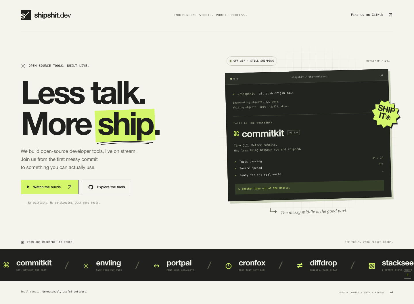
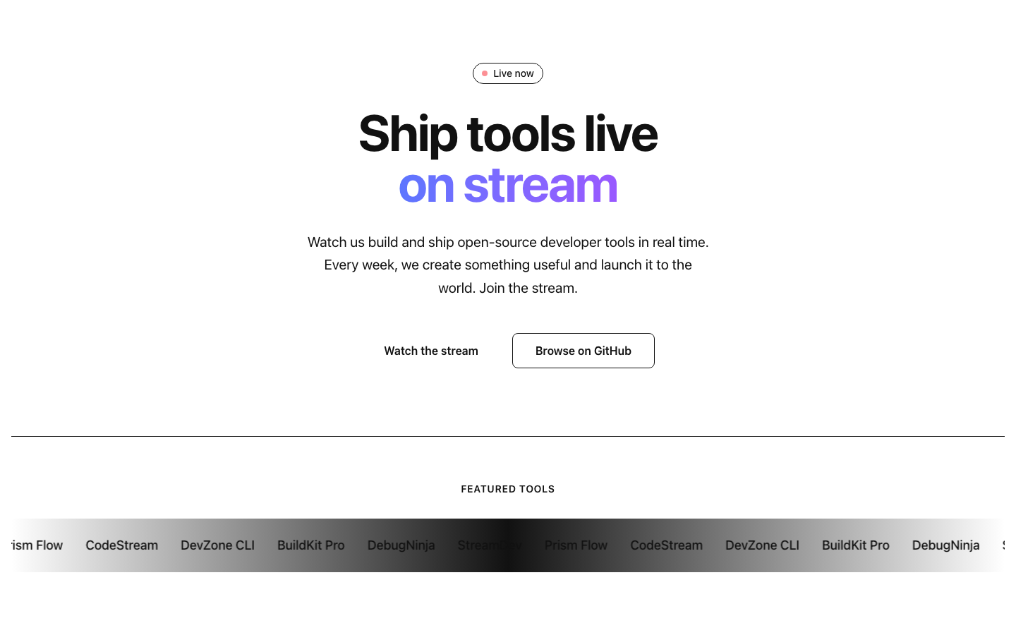
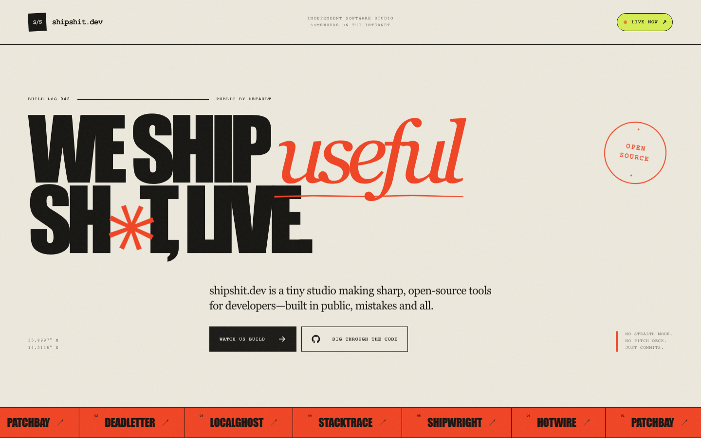
Aesthetics (weight 40)
- 0: Unstyled or visually broken layout.
- 1: Styled but generic; reads as an unedited template.
- 2: A coherent look with a color palette and spacing that hang together, but nothing distinctive about it.
- 3: A clear visual point of view (color, imagery or shapes, spacing) that fits a livestreaming dev-tools studio.
- 4: A striking, cohesive design that would stop a scroll on its own, with every element (headline, CTAs, status pill, marquee) feeling like part of one system rather than separately styled pieces.
Typography (weight 30)
- 0: Default system font with no scale; headline and body text are barely distinguishable.
- 1: A type scale exists but weights, sizes, or line lengths feel arbitrary.
- 2: A reasonable type scale with correct hierarchy between headline, subline, and CTAs, but generic font choice and default line height.
- 3: Considered font choice, scale, and line height that make the headline read as a real hero statement rather than a resized paragraph.
- 4: All of the above, plus deliberate letter-spacing, weight contrast, or pairing choices that show real typographic craft.
Motion and detail (weight 30)
- 0: No motion or interactive detail anywhere; every element is static with no hover or entrance treatment.
- 1: A single generic transition (e.g., a default browser hover) with no other detail work.
- 2: Some motion (marquee scroll, a button hover) but it feels mechanical or default, and the status pill has no visual treatment beyond a colored dot.
- 3: The marquee, CTA hover states, and status pill all have a considered treatment that reads as intentional rather than default.
- 4: All of the above, plus micro-details (an entrance animation, a subtle background treatment, a marquee that loops seamlessly) that reward a second look without feeling gratuitous.