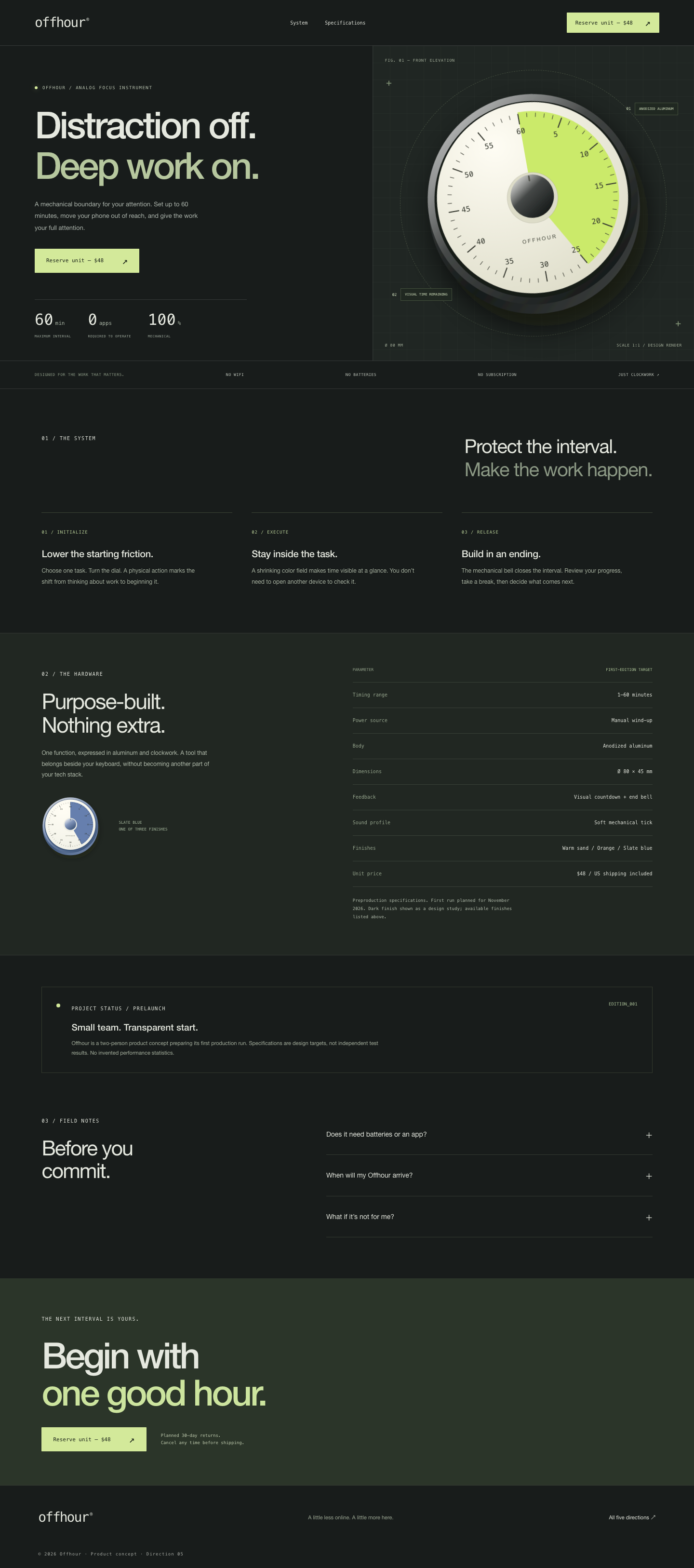
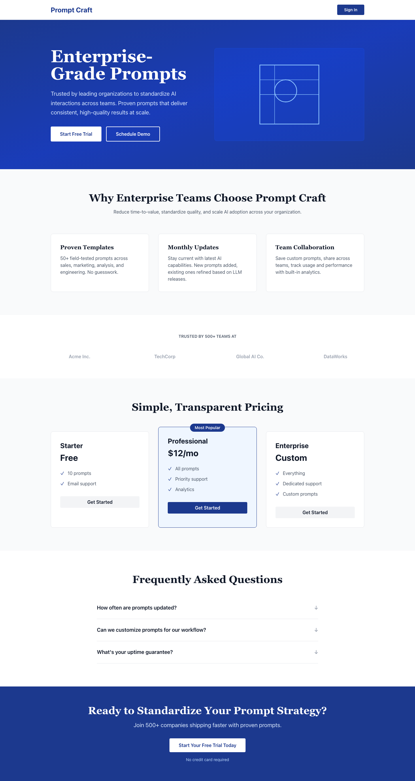
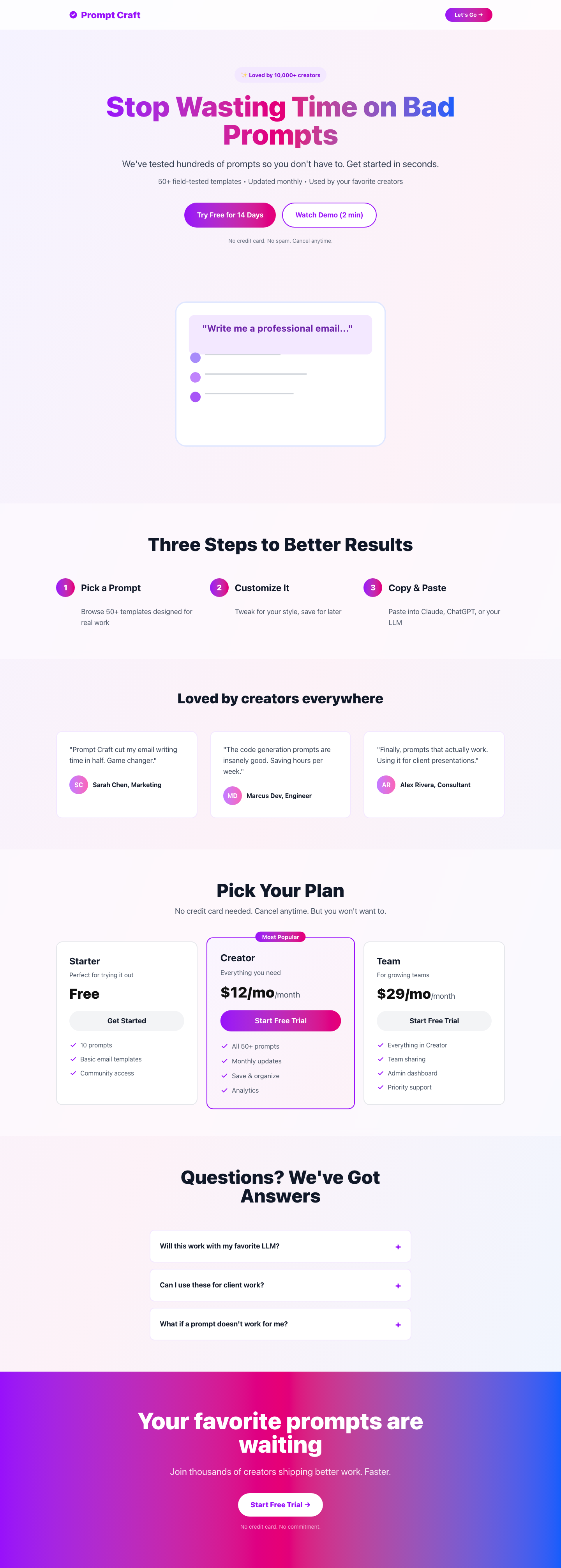
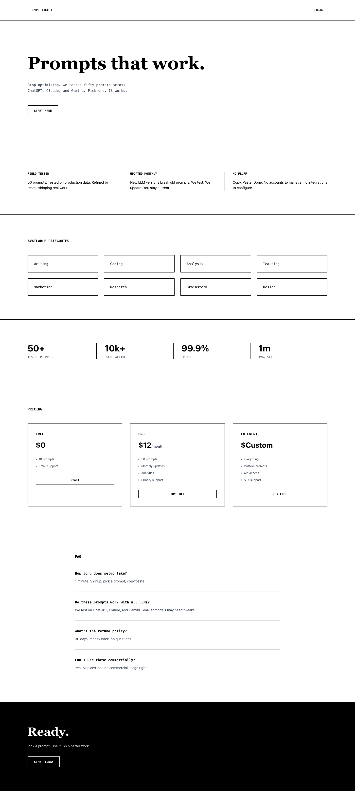
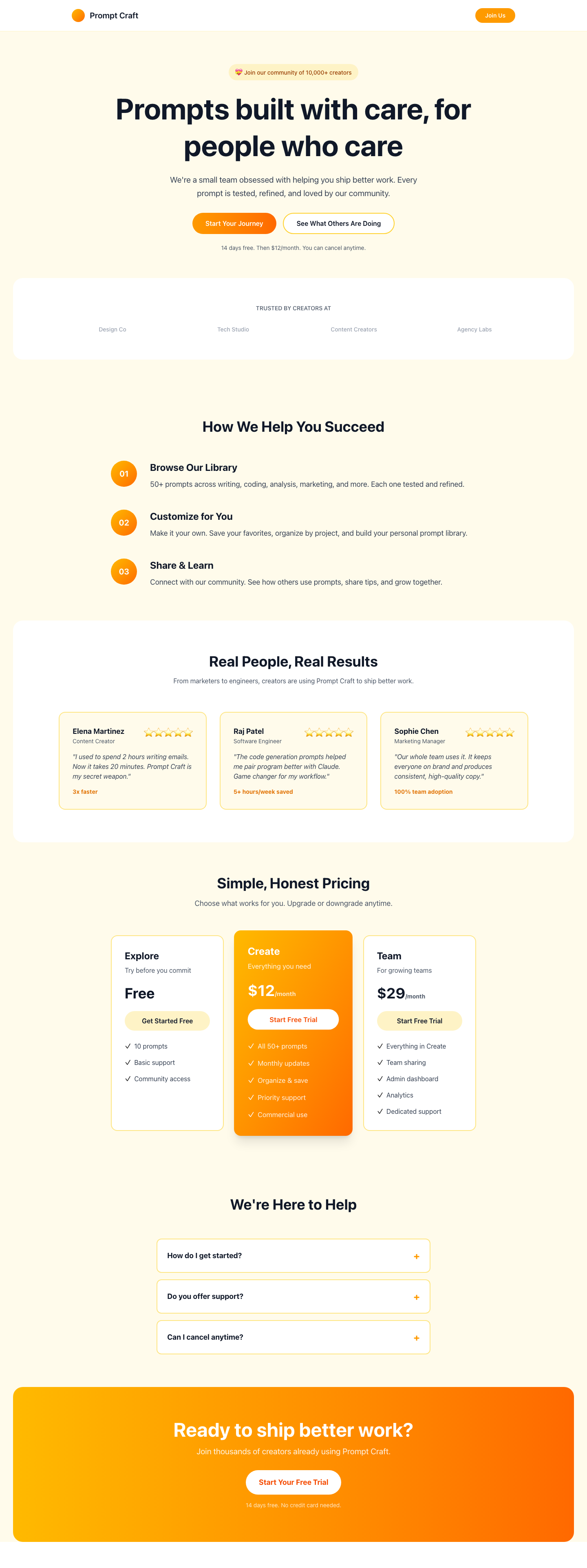
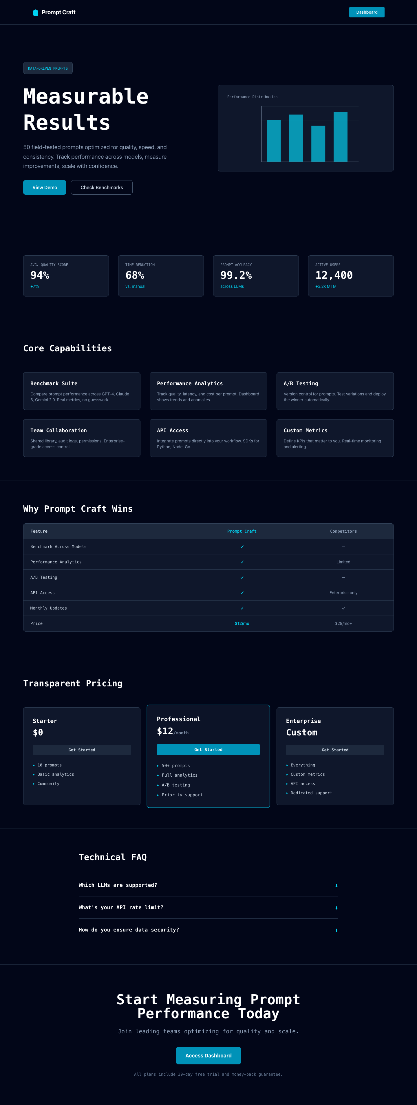
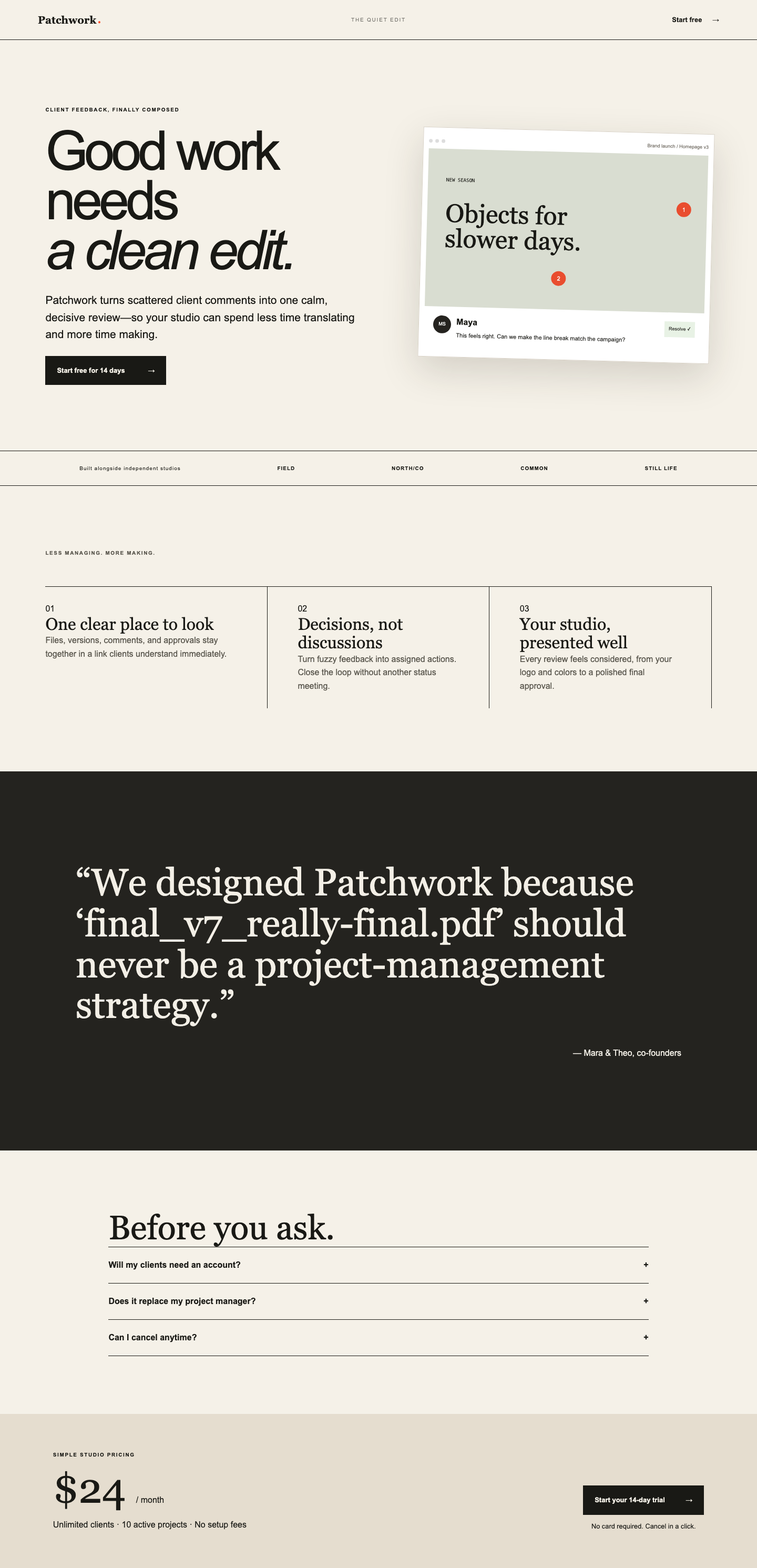
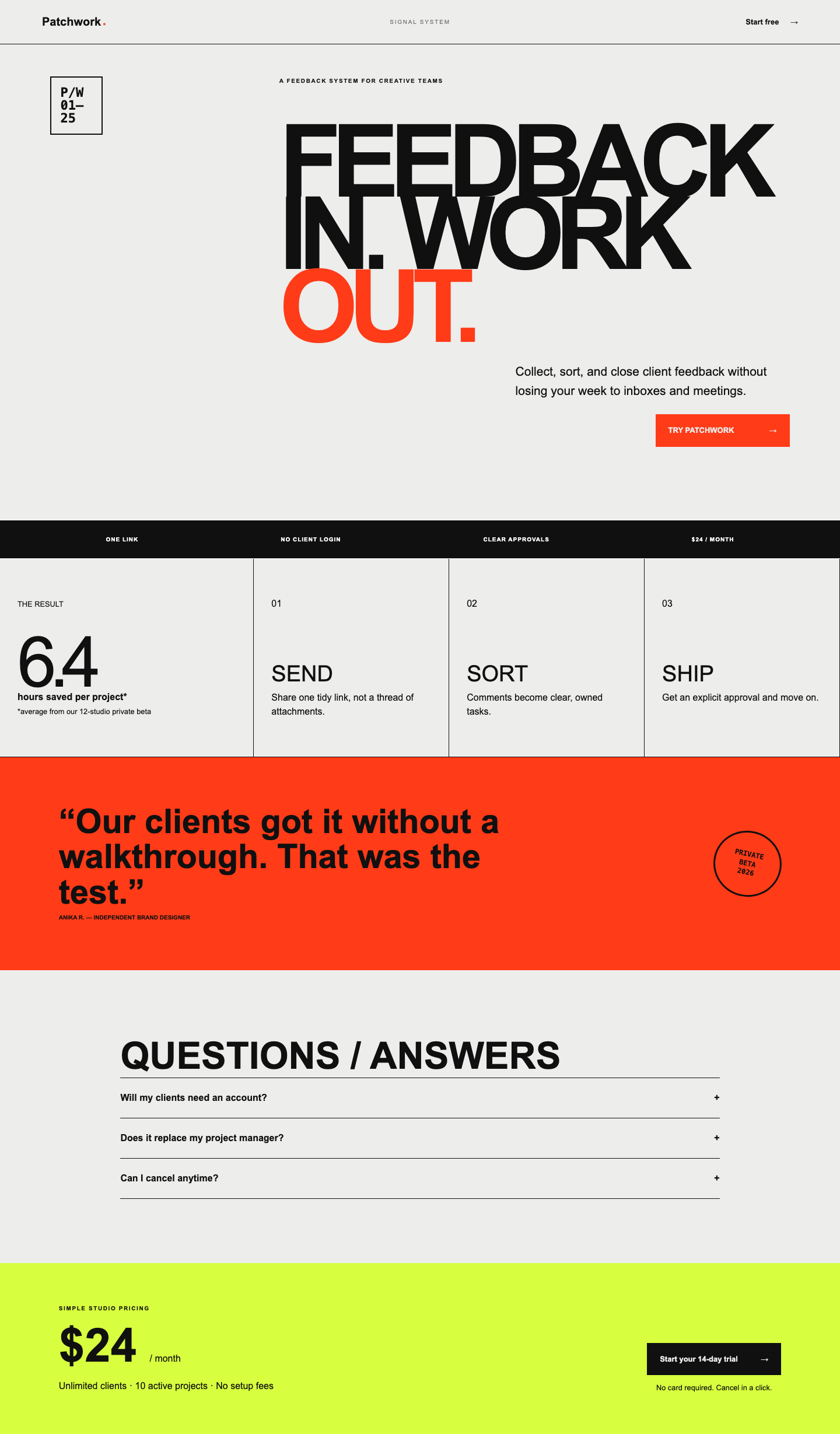
Rubric: landing page, five themes
You are judging five landing pages for one invented product or business, plus a THEMES.md
report in which the author describes the project, each theme, and which theme they recommend
shipping. The project may be software, a physical product, a service or a publication; judge
conversion structure against what that kind of page needs.
Evidence: screenshots of /themes/1 through /themes/5 at mobile, tablet and desktop widths,
and the report. Judge what is on screen. Do not reward length.
Score each dimension 0 to 4.
Conversion structure
Check every theme for these seven elements: (1) a clear value proposition in the first viewport, (2) one primary call to action visible without scrolling, (3) a closing call to action, (4) benefit-led sections rather than feature lists, (5) a credibility signal, (6) objection handling such as an FAQ, a guarantee, or shipping and returns for a physical product, (7) the price or a clear path to it, with readable hierarchy and contrast on the mobile screenshot. Count the elements present across all five pages, out of 35.
- 0: fewer than 10 of 35 present, or pages are broken.
- 1: 10 to 17 present.
- 2: 18 to 25 present. The playbook is followed loosely.
- 3: 26 to 32 present. Most pages would convert.
- 4: 33 to 35 present. Every page follows the playbook, and the primary action is unmistakable on each.
Distinctiveness
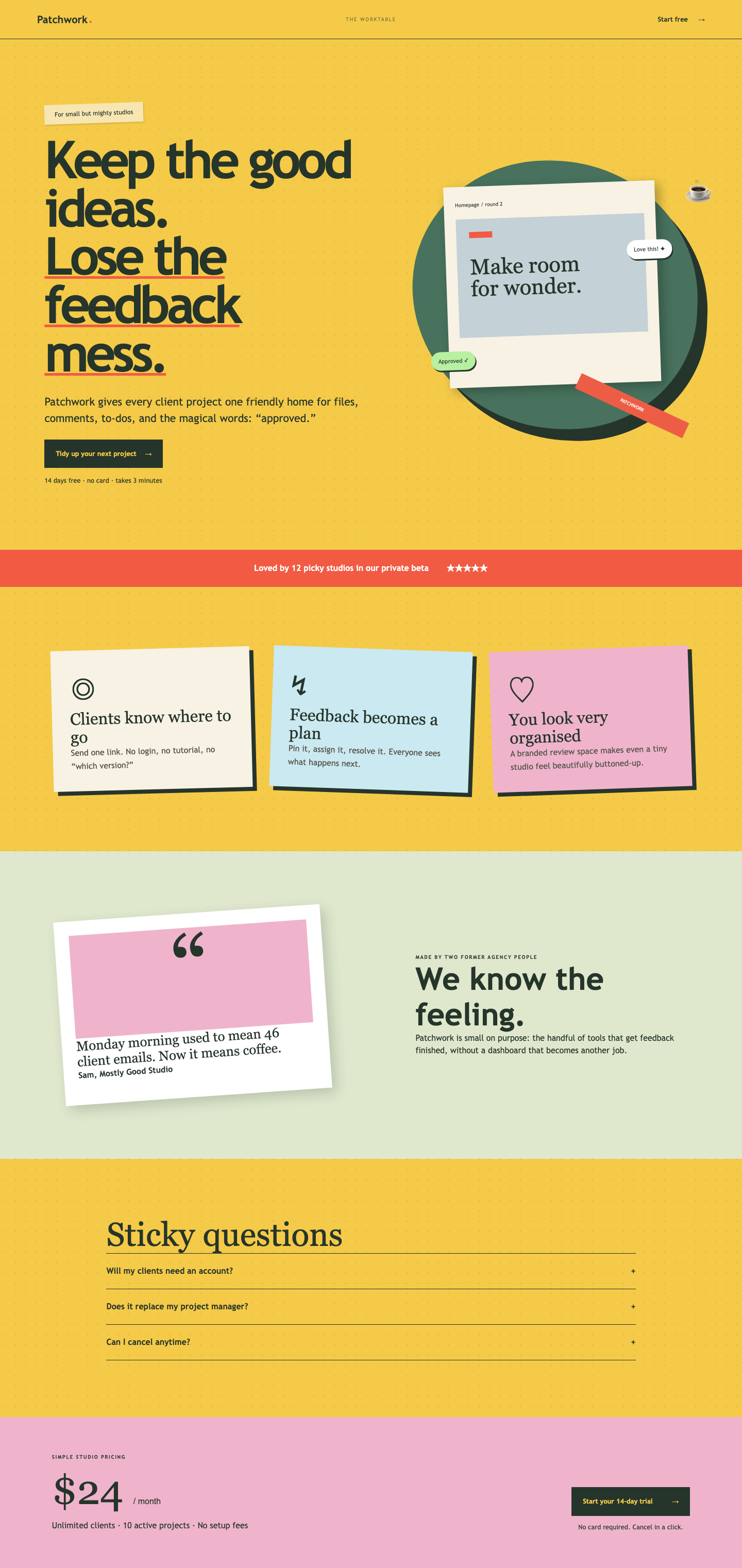
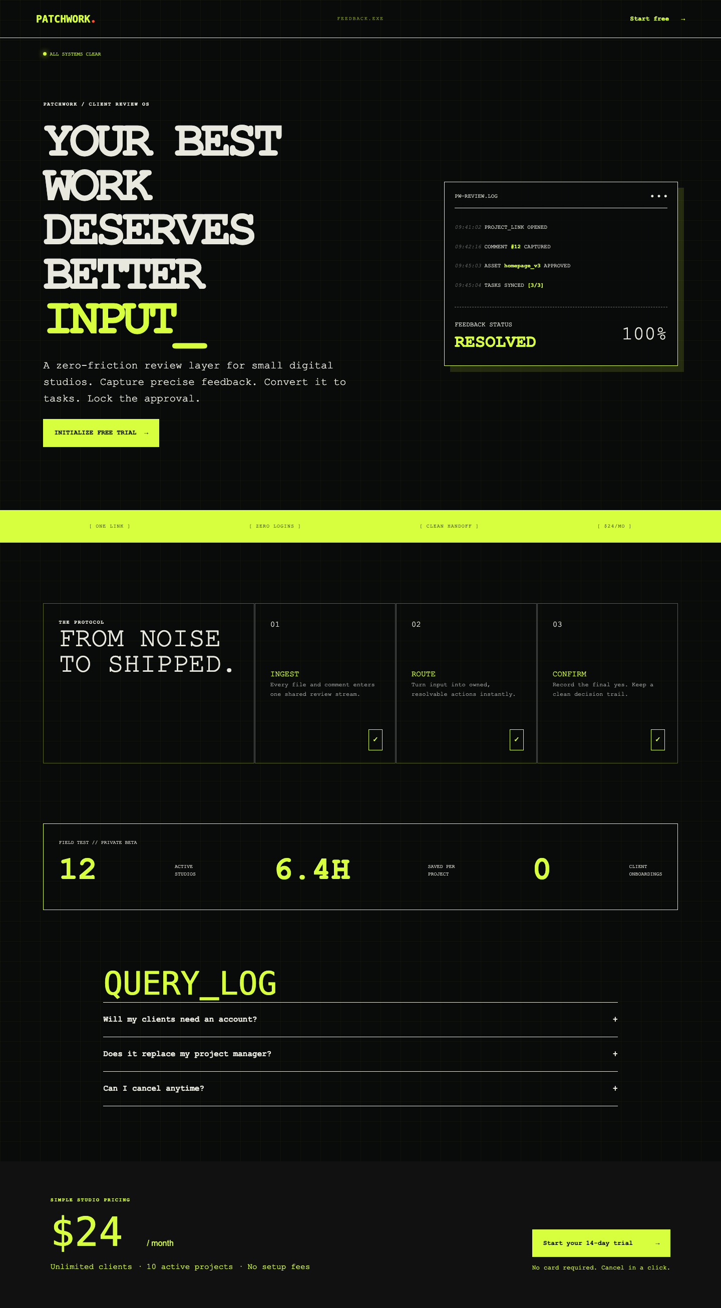
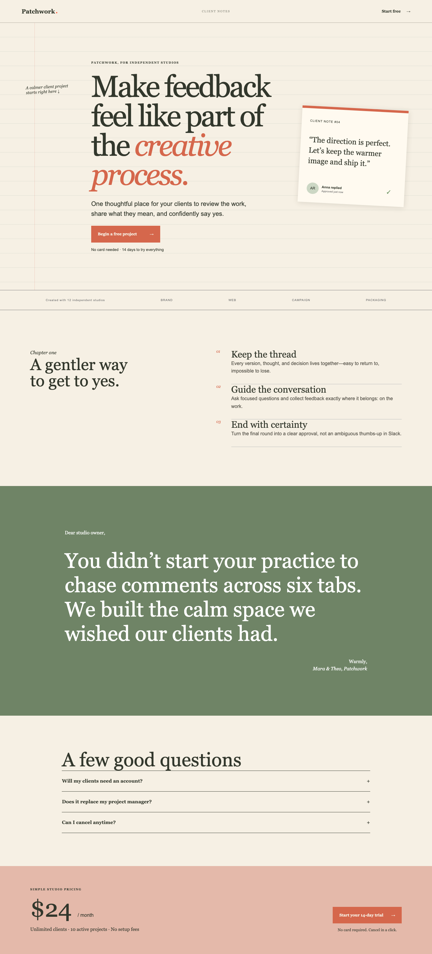
Are the five themes real design directions?
- 0: one design, repainted.
- 1: two directions at most; the rest are variants.
- 2: three clearly different directions; two are variants.
- 3: four or five distinct directions, differing in type, layout and tone, not only color.
- 4: five directions a design lead would recognize as separate briefs, each internally coherent, each plausibly aimed at a different buyer.
Craft
Typography, spacing, rhythm, alignment, restraint in motion and decoration, quality at all three widths.
- 0: broken layouts or unreadable text.
- 1: functional, generic, defaults showing.
- 2: tidy, consistent, no obvious mistakes, nothing memorable.
- 3: deliberate type scale and spacing, strong alignment, responsive layouts that were designed rather than collapsed.
- 4: work a good agency would ship: optical alignment, considered pairings, details that reward a second look, nothing gratuitous.
Copy
Headline, subline and section copy across the themes.
- 0: placeholder or nonsense copy.
- 1: generic claims ("supercharge your workflow").
- 2: clear and specific, states what the product does and for whom.
- 3: specific, benefit-led, matches the visual tone of each theme.
- 4: a founder would ship these headlines unchanged; each theme's voice is distinct and credible.
Judgment
Read the recommendation in THEMES.md. Look at the recommended theme.
- 0: no recommendation, or the recommended theme is broken.
- 1: a recommendation with no reasoning, or reasoning that contradicts the screens.
- 2: a defensible pick with generic reasoning.
- 3: the pick is among the two strongest themes and the reasoning cites the audience, the conversion structure and a tradeoff honestly.
- 4: the pick is the strongest theme, the reasoning is sharp and specific, and the invented project itself is plausible and well positioned.
Pairwise
When comparing two entries, compare their recommended themes first, then the set of five. Prefer the entry you would rather hand to a real founder tomorrow.