bench

tests · UX/UI

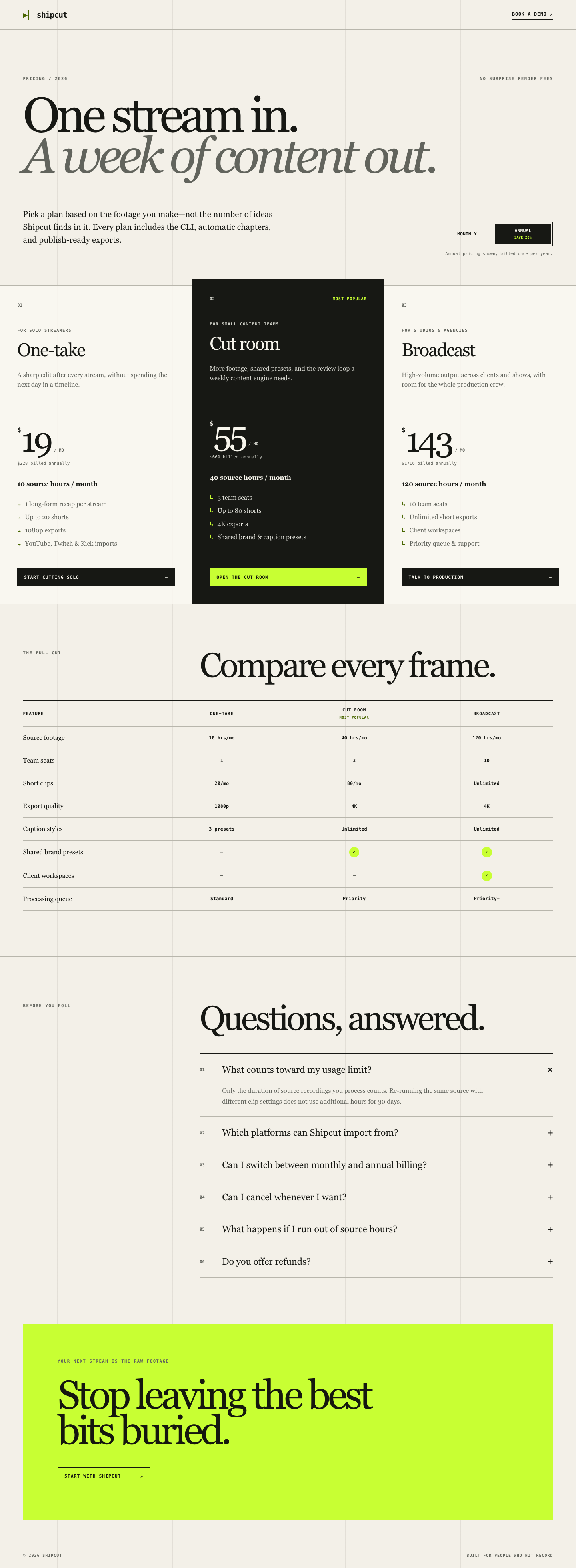
Shipcut pricing page

Can it design, not just code?

Post on X
v1authored Sep 6, 202660 turns · $10 budget · 30m timebox
gatesrubricpairwise

Prompt

# Build the Shipcut pricing page

You are working inside a minimal Next.js app. Your job is to design and build the pricing
page at `/pricing`.

## Product

Shipcut is a CLI tool that turns a livestream recording into a long-form recap video and a
batch of short clips, ready to publish. Buyers are solo streamers and small content teams.

## Requirements

Build out `app/pricing/page.tsx` (and any components you add under `components/` or
`app/pricing/`) into a complete pricing page with all of the following:

- Three pricing tiers aimed at different buyers (for example a solo streamer, a small team,
  and a studio or agency). Invent realistic tier names, prices, and feature lists that fit
  the product.
- A working annual/monthly billing toggle that updates the displayed price for every tier
  without a page reload.
- A feature comparison table below the tier cards that lists specific features as rows and
  the three tiers as columns, showing which tier includes which feature.
- An FAQ section with at least five realistic questions and answers (billing, cancellation,
  usage limits, supported platforms, refunds, etc).
- A clear call to action on each tier.

## Constraints

- The page must be fully responsive: usable and well laid out on a phone-width viewport, a
  tablet-width viewport, and a desktop-width viewport, with no horizontal scrolling and no
  overlapping content at any width.
- The page must be accessible: correct heading structure, sufficient color contrast,
  keyboard-operable toggle and buttons, visible focus states, and no reliance on color alone
  to convey which tier is recommended.
- The page must support both light and dark mode, following the system color scheme. Every
  piece of text must stay readable in both modes.
- Do not introduce a component library or CSS framework beyond what is already in the
  fixture (Next.js and Tailwind CSS). Do not add a backend, database, or payment
  integration; this is a static marketing page.
- Update `app/page.tsx` only if needed to keep its existing link to `/pricing` working.
- Keep `bun run build` and `bun run start` working exactly as documented in the fixture's
  README.

Work only within this fixture directory. When you are done, the page should look and feel
like something a real dev tool would ship, not a rough draft.

Fixture

11 paths under fixture/, copied into a fresh run dir for every attempt.

.gitignore
app/
app/globals.css
app/layout.tsx
app/page.tsx
app/pricing/
app/pricing/page.tsx
next.config.ts
package.json
postcss.config.mjs
tsconfig.json

How it is scored

Gates, run in order

  1. installRuns `bun install` and must exit 0.
  2. buildRuns `bun run build` and must exit 0.
  3. axe-pricingServes the app and scans /pricing for accessibility violations, failing on serious impact or worse.

Subjective layer · weights

  • Aesthetics (30)
  • Visual hierarchy (25)
  • Interaction states (25)
  • Responsiveness (20)

Rubric: Shipcut pricing page

Score each dimension 0 to 4. Base every score on the screenshots and the diff; do not infer intent that isn't visible in the artifacts.

Aesthetics (weight 30)

  • 0: Unstyled or visually broken; default browser styles, misaligned elements, or clashing colors.
  • 1: Styled but generic; looks like an unedited template with no attention to detail.
  • 2: Coherent color palette and spacing, but flat and forgettable; nothing distinguishes it from a stock pricing page.
  • 3: A clear visual identity, considered color and spacing choices, and a recommended-tier treatment that reads as intentional.
  • 4: Production-grade polish: consistent visual rhythm, deliberate use of color and elevation, and details (icon choices, dividers, background treatment) that make the page feel designed rather than assembled.

Visual hierarchy (weight 25)

  • 0: No discernible order; the eye has no clear path through pricing, features, and FAQ.
  • 1: Sections exist but compete for attention; the recommended tier and price are not visually emphasized.
  • 2: Basic hierarchy present (headline, tiers, table, FAQ in order) but weight and size choices are arbitrary.
  • 3: Clear primary path (headline to tiers to CTA) with the recommended tier and prices reading first.
  • 4: Hierarchy actively guides the buyer: price and CTA are unmissable, the comparison table supports rather than competes with the tier cards, and the FAQ is clearly secondary.

Interaction states (weight 25)

  • 0: The billing toggle does not work, or buttons/links have no visible states at all.
  • 1: The toggle works but interactive elements are missing hover, focus, or active states.
  • 2: Hover and focus states exist but look like browser defaults or are inconsistent across elements.
  • 3: Every interactive element (toggle, CTAs, FAQ disclosure if present) has a considered hover and a visible keyboard focus state.
  • 4: States are polished and consistent system-wide, including a smooth toggle transition, and focus states are clearly visible without being jarring in both light and dark mode.

Responsiveness (weight 20)

  • 0: Layout breaks at one or more of the three captured viewports (overlap, cut-off text, horizontal scroll).
  • 1: No breakage, but the layout is just a shrunk desktop layout with cramped text or awkward wrapping on mobile.
  • 2: Reasonable adaptation at each viewport, but the comparison table is hard to use on mobile (e.g., unreadable without horizontal scrolling).
  • 3: Tier cards and the comparison table both adapt sensibly to each viewport, with a mobile-appropriate treatment of the table.
  • 4: Each viewport feels like it was designed for that size, not just resized, including spacing, type scale, and table treatment tuned per breakpoint.
Results across releases

v2026.09-smoke · Sep 6, 2026

AgentObjectiveSubjectiveCombinedRun
grok · grok-4.6#1
claude · haiku · low#1
codex · gpt-5.6-sol · low
100.0 (100.0100.0, n=1)
#1